I recognize the importance of giving people a place to voice opinions, and it is not my intention to stifle that. One thing to remember, though, is that sharing a negative opinion is a choice you can make. Sometimes it can have a good outcome, and sometimes it really doesn't accomplish much for any good at all. With our web artist, I do think we should be careful with how much we "run our mouths" with negative feedback. That being said, I value feedback and don't mind hearing opinions that can help guide future efforts for our visual branding. Keep in mind, though, that the current drawings are set in stone. They are not going to change, and most people seem to be delighted with the results.
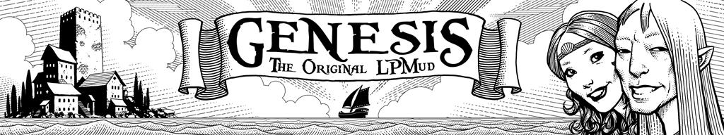
Let me share a bit of my own rationale for the style we have chosen to go with. I believe Genesis has a unique appeal to those people who are of the generation that "grew up" with Dungeons and Dragons. D&D was, in its early years, illustrated by people like Denis Loubet, our artist. The drawings were fine-line work most often in black and white, and had a particular type of "feel" to them that I believe we have captured with our web top-banner. This "feel" is actually quite cheerful, positive, and joyful. Even the evil creatures that were drawn for early D&D manuals often had a sense of "fun" to them. It is only in more modern times that roleplaying games have emerged with more of the self-serious, depressive, gloomy, etc. type of imagery. Some people like that stuff ... but I don't feel it characterizes the core of what Genesis offers. We offer community, adventure, and old-school fun. Sure, you can be evil and gloomy if you like, but it isn't the primary energy of the place for new players. Adventure, excitement, exploration, fun ... this is what we offer to new players, and I feel our top-banner design captures this wonderfully.
As I've stated, we will not be "changing course" with our visual brand. I realize there are some of you who do not find what we have chosen appealing, or characteristic of the Genesis you experience. My hope is that the majority of you do feel enthusiastic about our artist, and the feedback I have gotten so far suggests this is indeed the case. One thing I do think we can do, however, is commission him to create a top-banner that shows the "evil" side of Genesis, with not-so-happy faces displayed doing all sorts of scowling, grimacing, and tooth gnashing as they plot the downfall of all peace-loving do-gooders. We could then allow people to choose either the "evil" or "good" banner as a preference when they visit the website. This, of course, is just an idea, but perhaps it would address the concern I have heard from some of you that the banner feels too "happy." (somehow I think "happy" is okay for promotional purposes!
So ... here is a thread in which to voice your opinion. I do suggest that you consider what you post, though. Just posting a bunch of sour grapes isn't really going to accomplish much ... as if it ever did.
Thanks everyone!
G.